
TAURUS LAND CARE
LOGO DESIGN
BRANDING
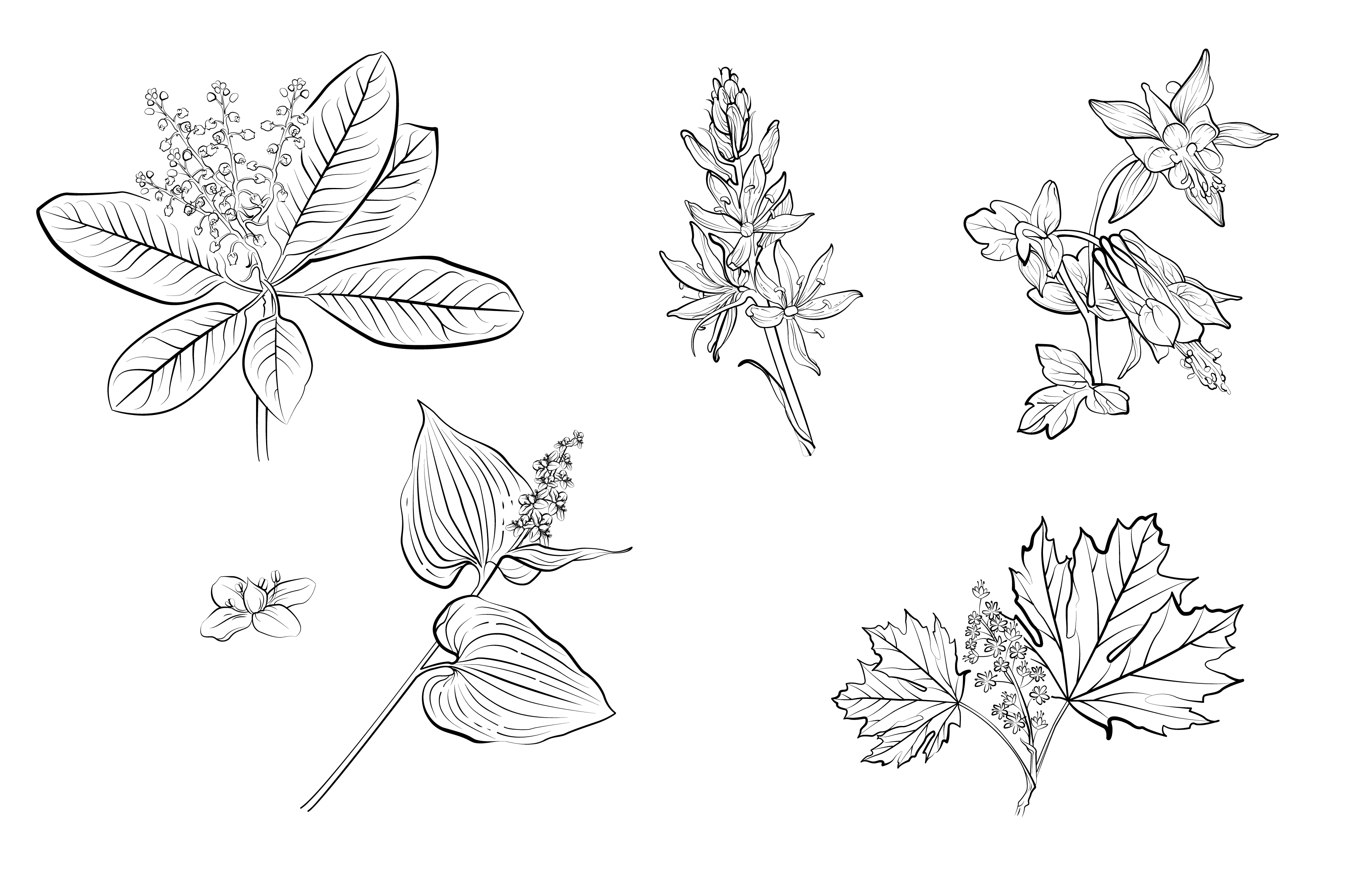
ILLUSTRATIONS
MERCHANDISE
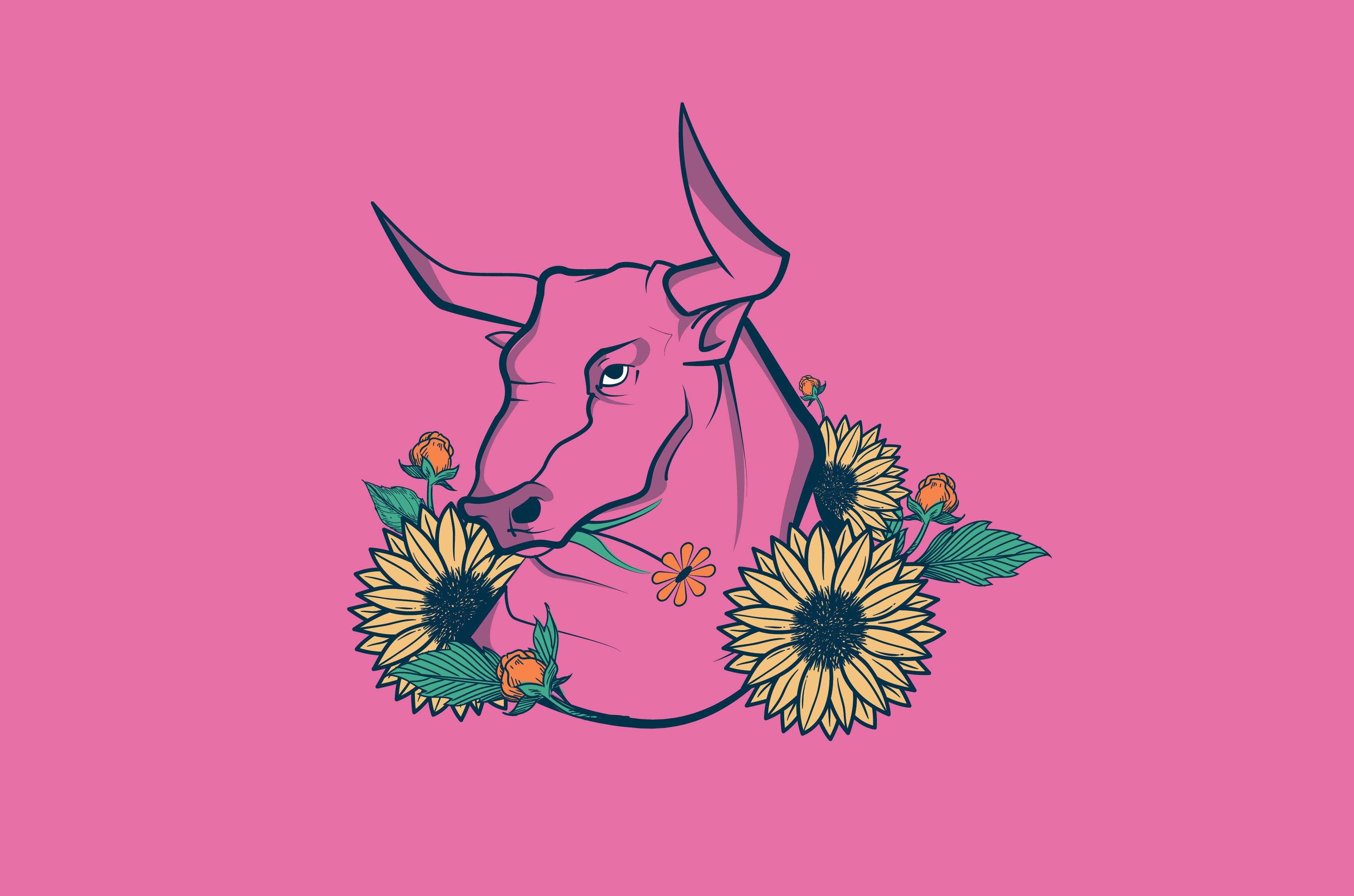
Within the picturesque landscapes of British Columbia, I had the incredible opportunity of collaborating with a visionary queer-owned landscaping company called Taurus Land Care. Drawing inspiration from the owner’s deep passion for ecology and the region's native flora, I crafted a captivating logo that encapsulated their commitment to environmental stewardship and inclusivity within this beautiful geography. The design featured a striking pink bull, symbolizing strength and resilience, adorned by a vibrant array of native flowers. By intertwining the beauty of British Columbia's natural surroundings with a bold representation of queer identity, this design truly celebrated the diversity and spirit of the business. Together, we created a visual identity that spoke volumes about the company’s values, promoting ecological harmony while fostering a welcoming space for all within the trade industry.
tauruslandcare.ca
LOGO VARIATIONS & BRAND COLORS

WEB SITE LAYOUT

MERCHANDISE & POSTER


RESULTS
1
Strong visual identity with
a bold color twist.
2
Unique hand-drawn elements
and illustrations.
3
Visual representation of
queer-owned business.
TIME TO START MAKING AMAZING
THINGS TOGETHER
[ GET IN TOUCH ]
MY WORK
BEHANCE
Selected Works