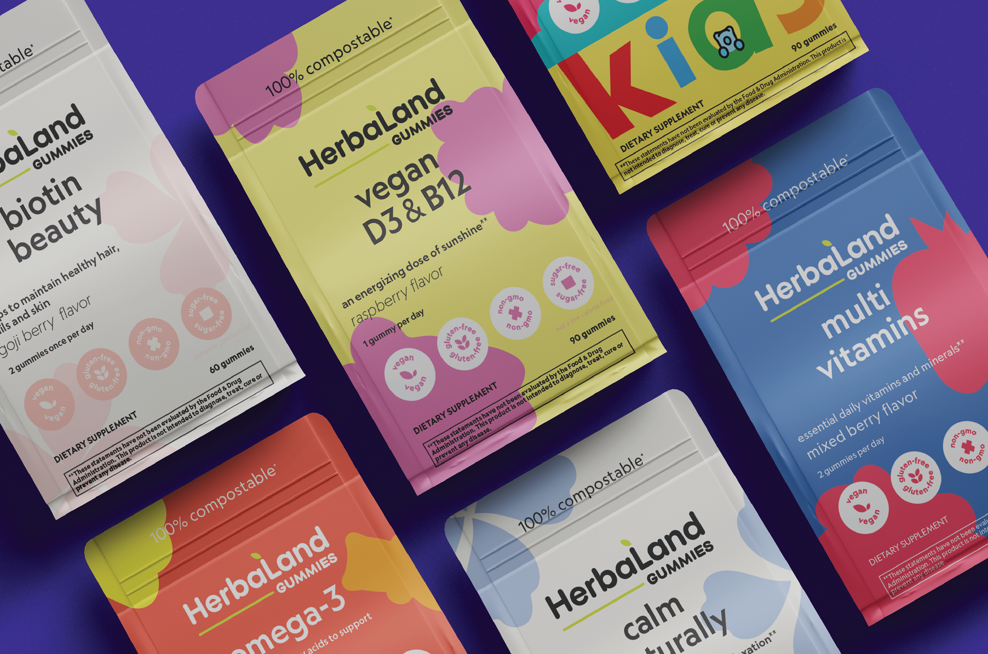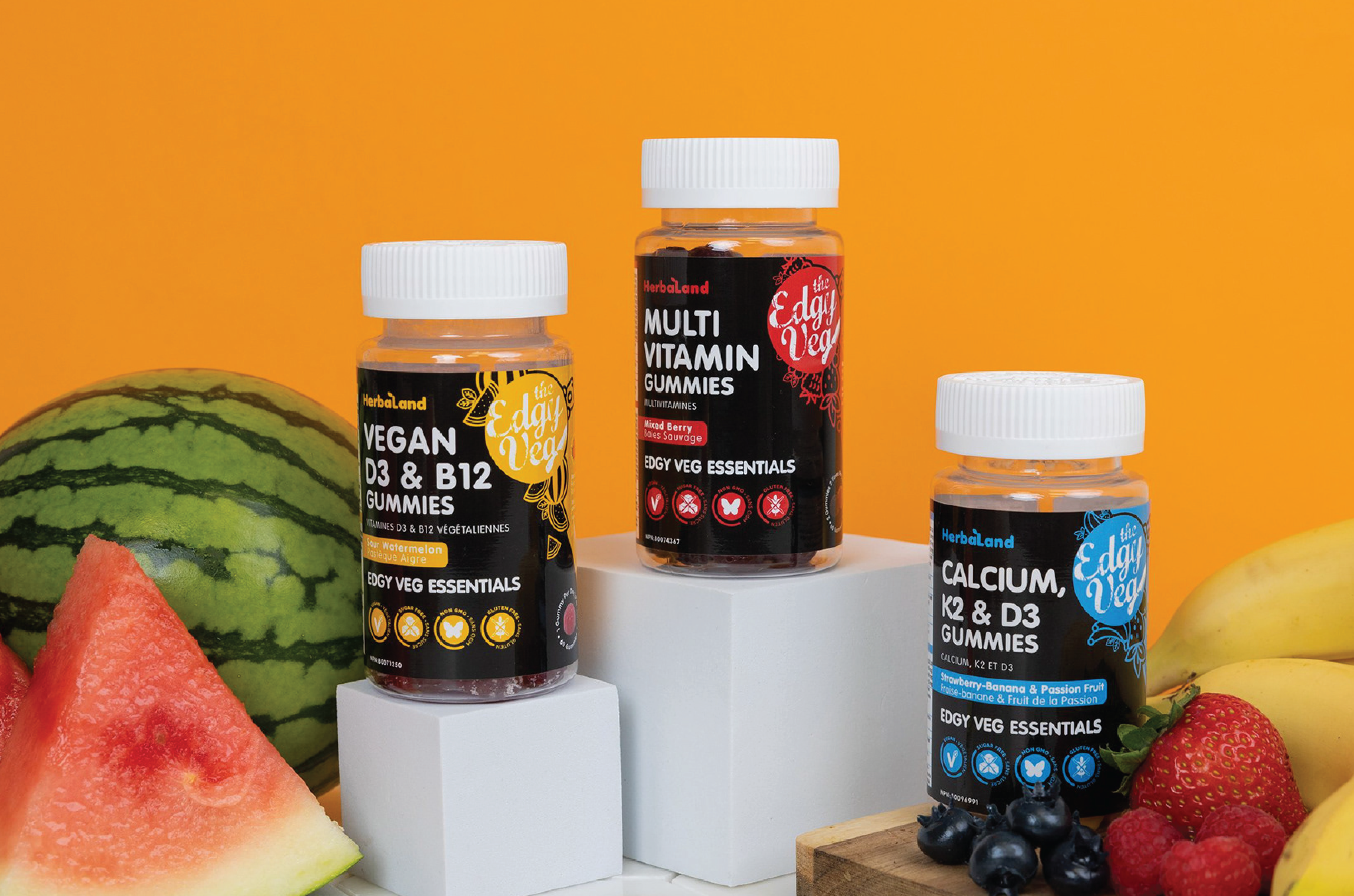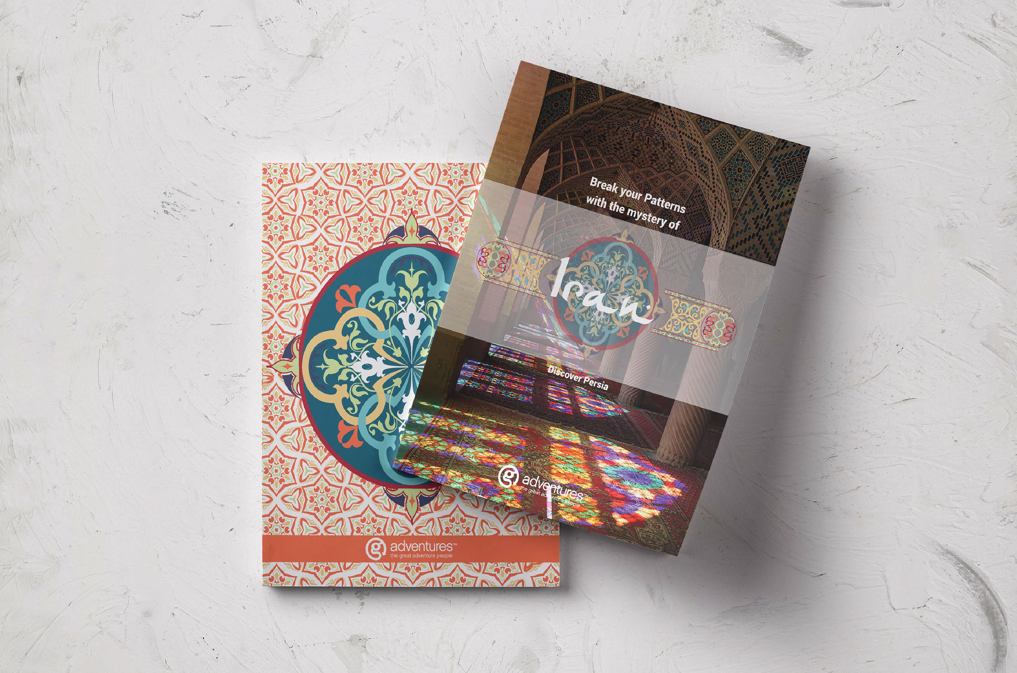

SIMPLY SEEDS
PACKAGING
LABEL DESIGN
Simply Seeds Butter is a premium product designed specifically for individuals with nut allergies, offering a nut-free alternative that mirrors the taste and texture of traditional nut butter. As the designer tasked with this project, my challenge was to harmonize the product's benefits with visually appealing colours (pink and teal) for a straightforward label design. Through my meticulous attention to detail, I successfully crafted a minimalist label that stands out on shelves, distinguishing it from competitors while effectively communicating its unique selling points.


RESULTS
1
Updated,
fresh look.
2
Enhanced differentiation
from competitor.
3
Clear, direct communication
through design.
TIME TO START MAKING AMAZING
THINGS TOGETHER
[ GET IN TOUCH ]
MY WORK
BEHANCE
Selected Works