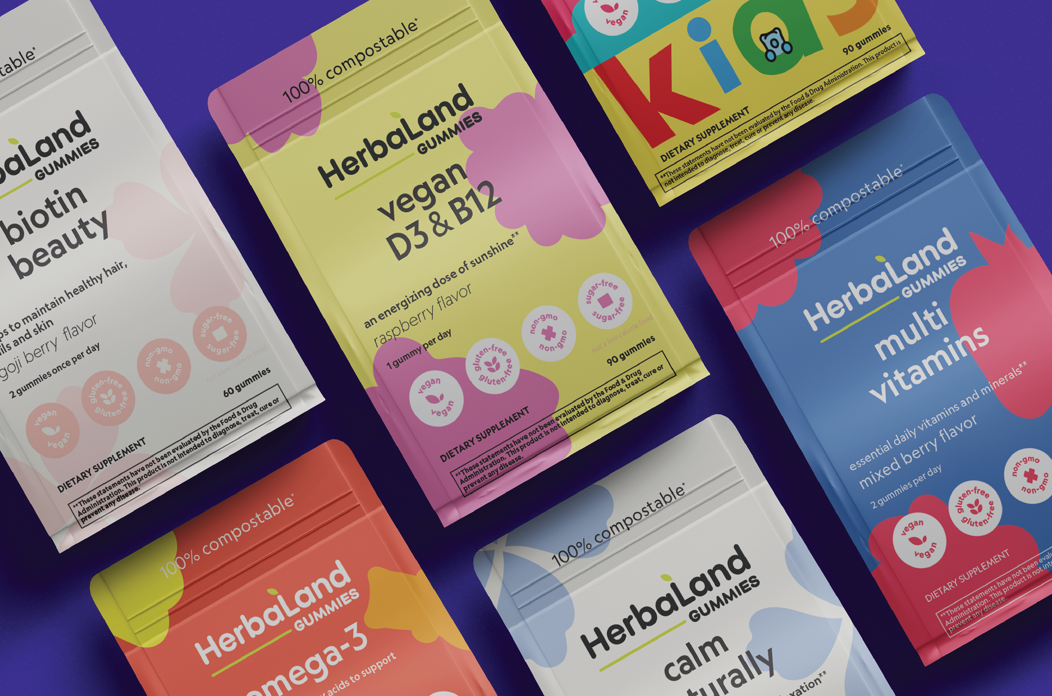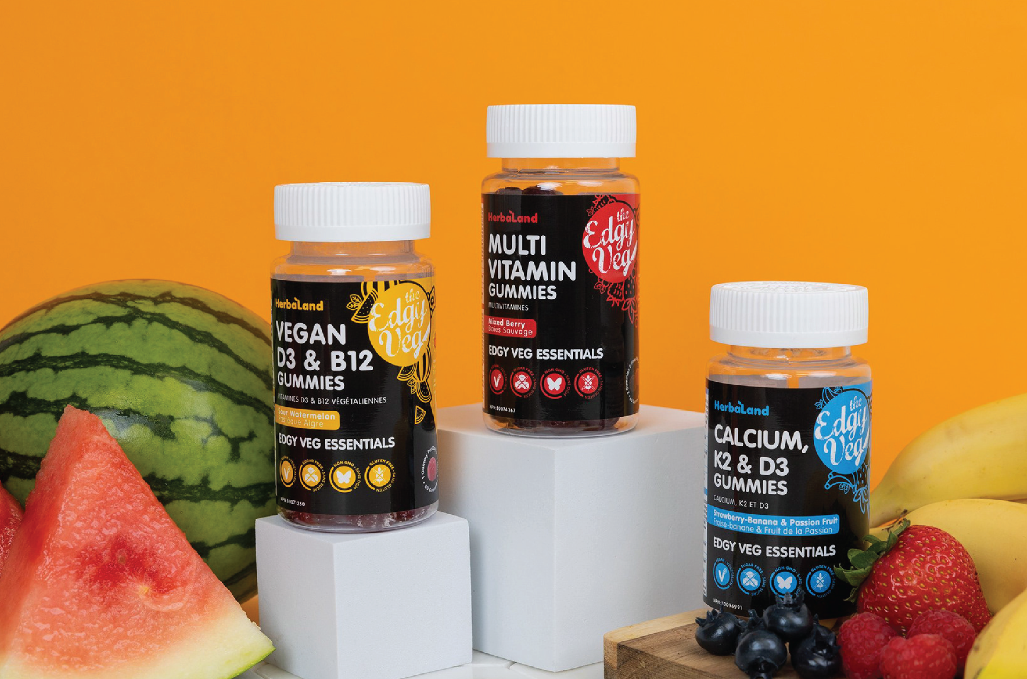

HEBALAND GUMMIES
COMPANY REBRANDING
PACKAGING DESIGN
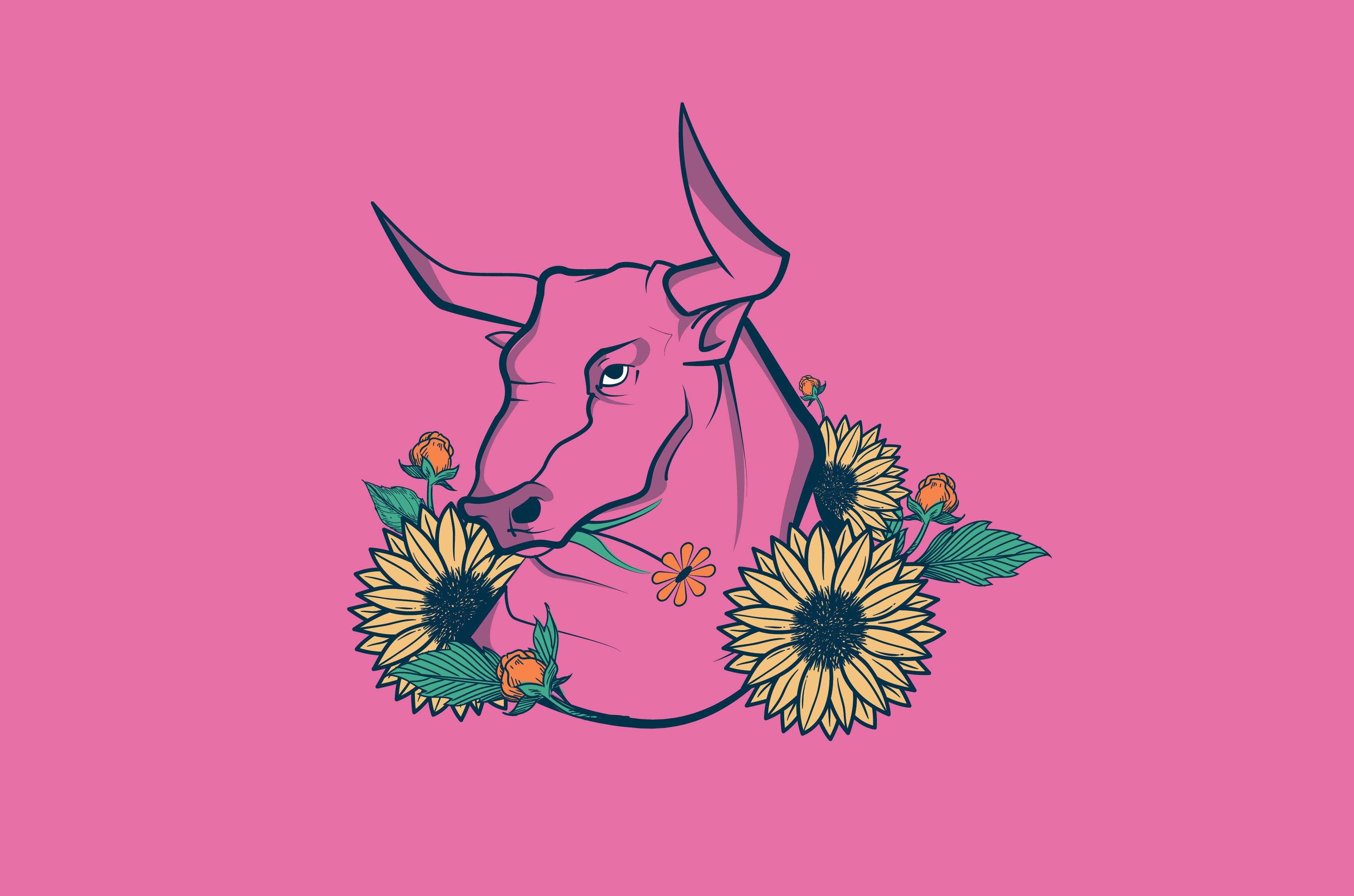
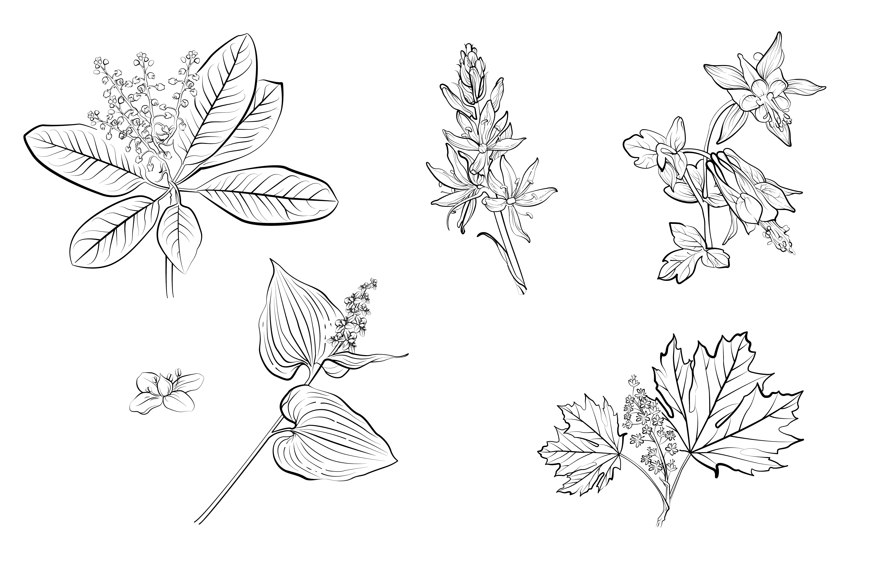
ILLUSTRATIONS
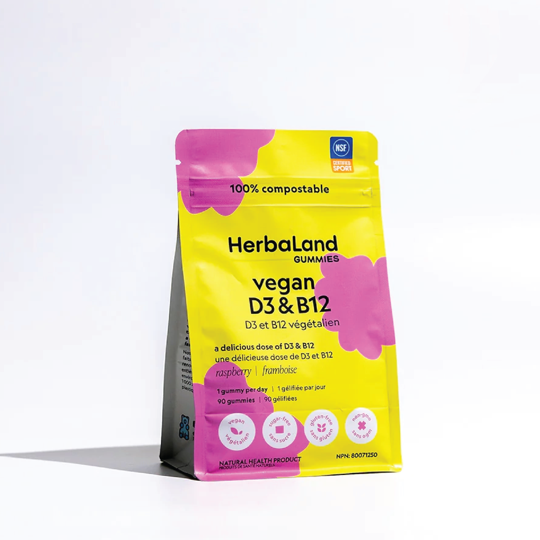
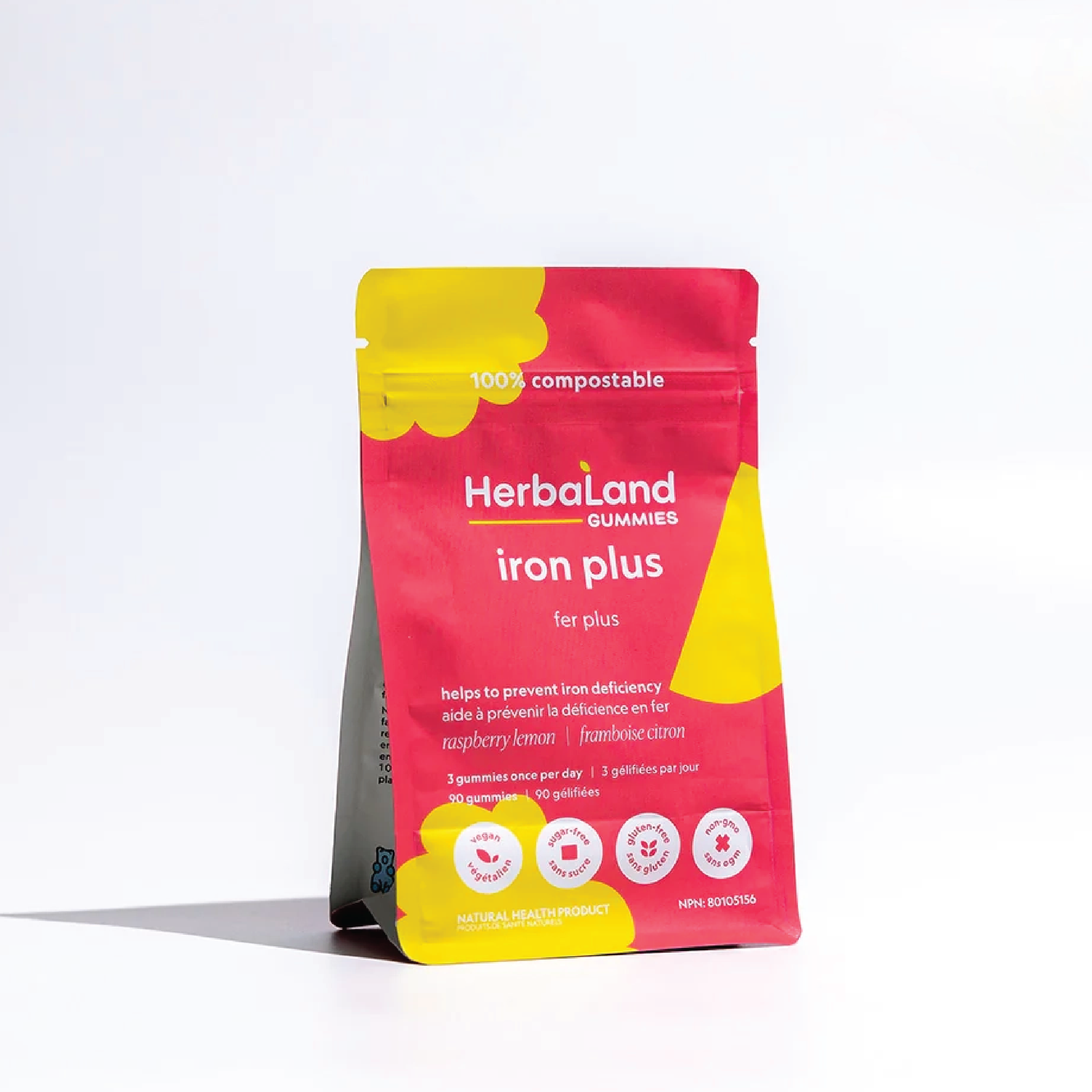
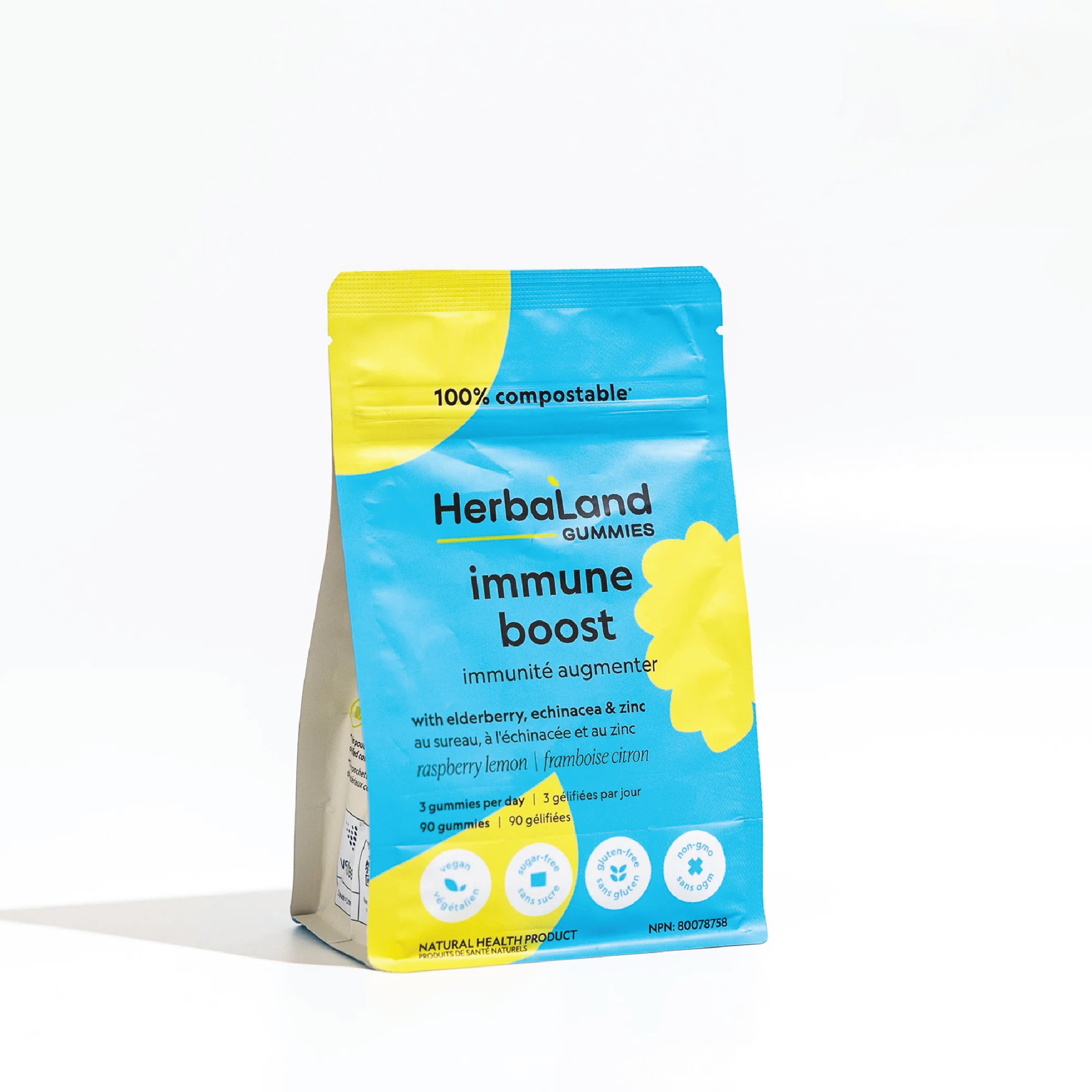
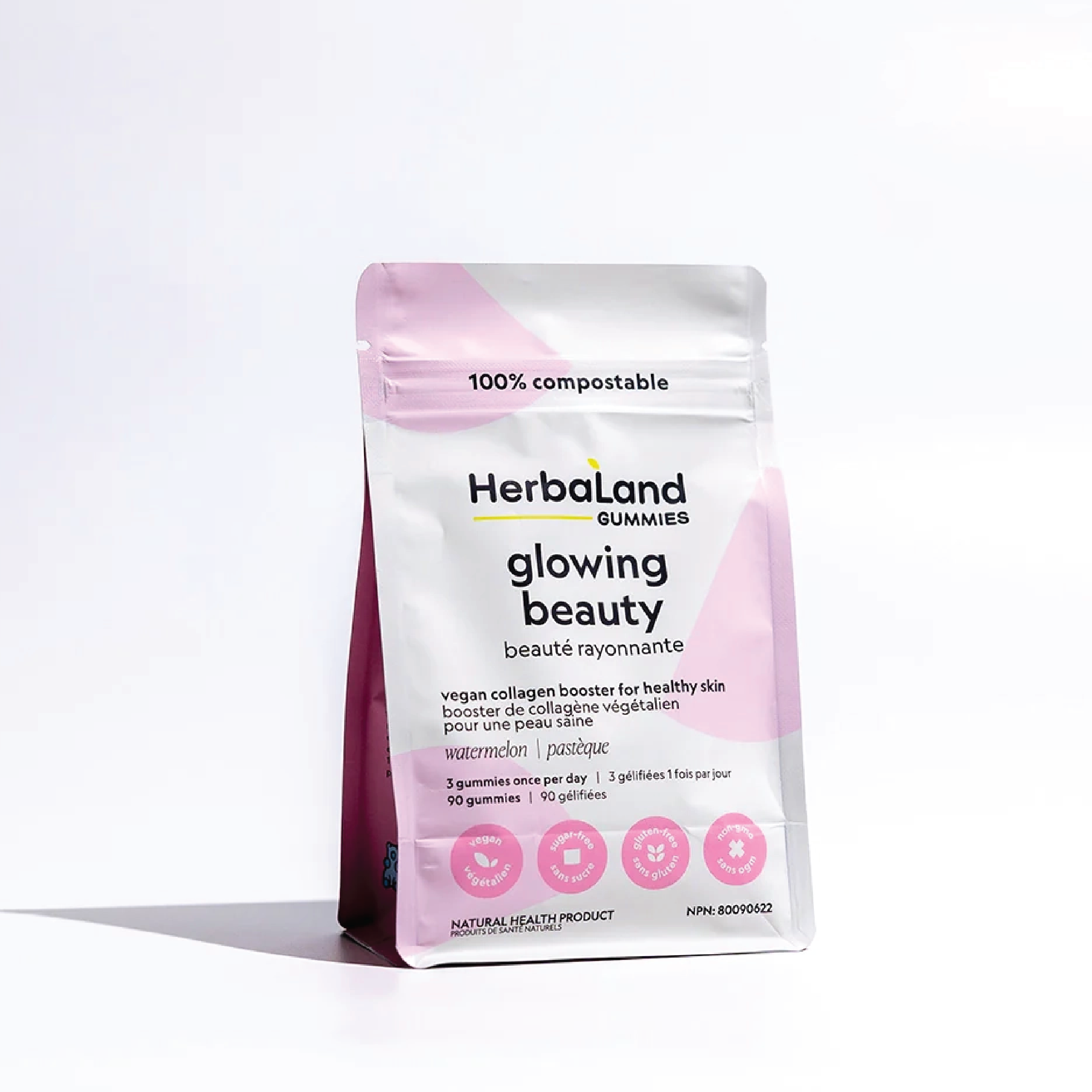
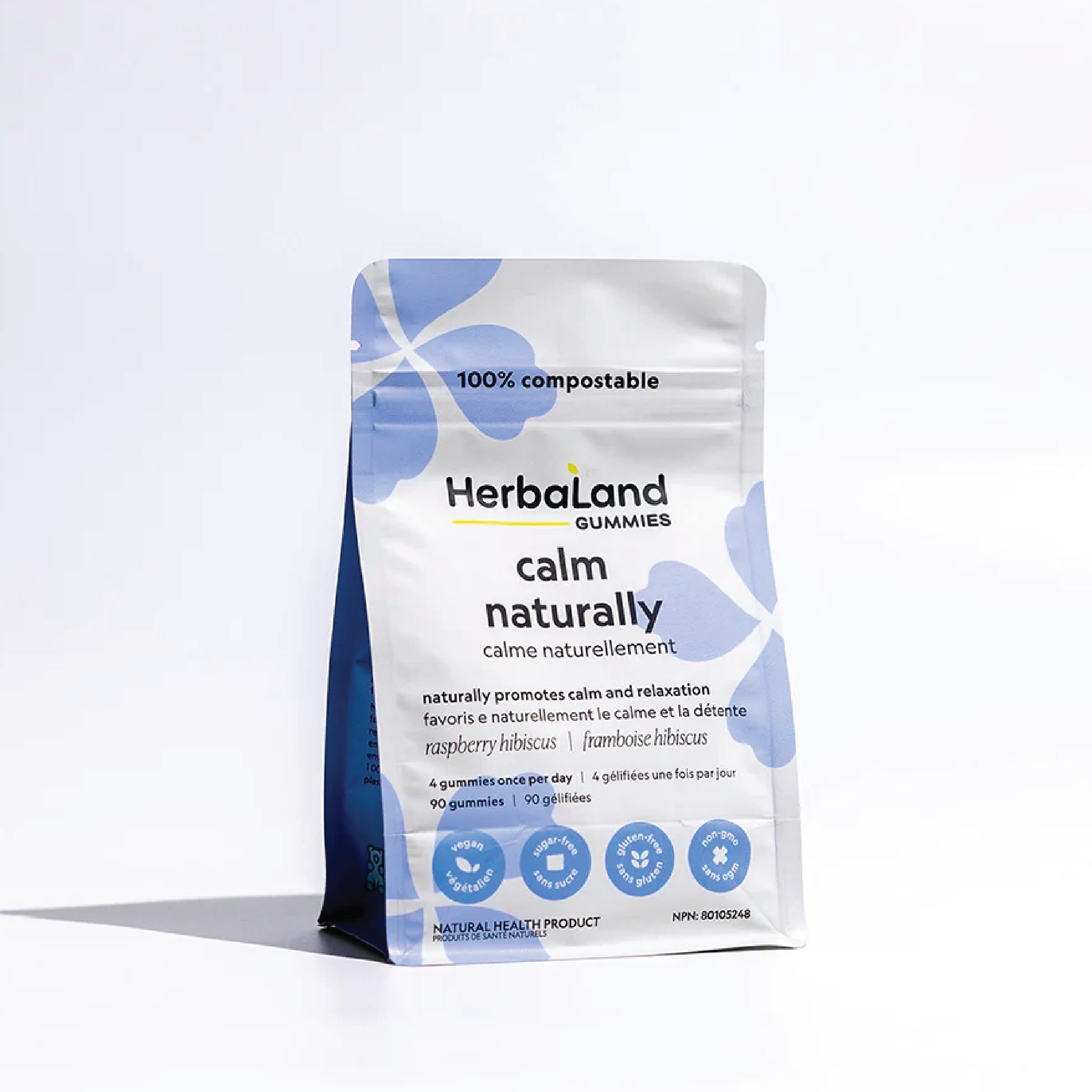
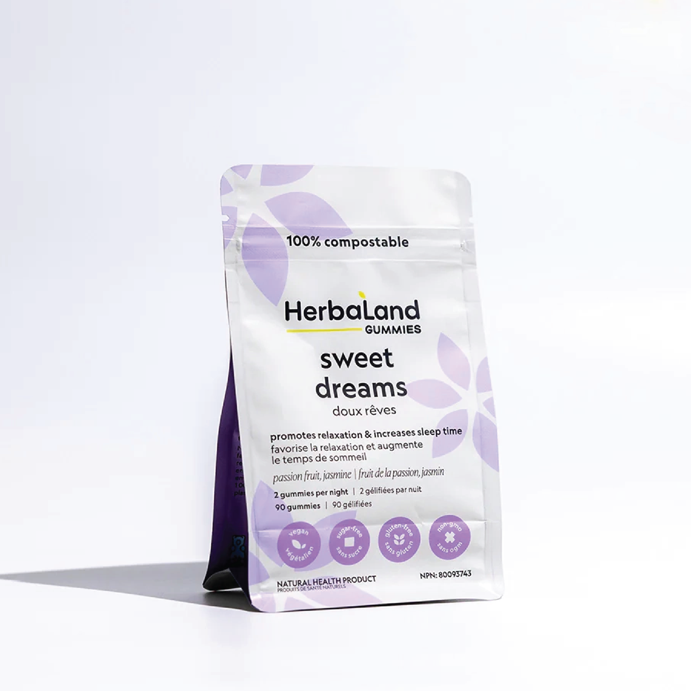
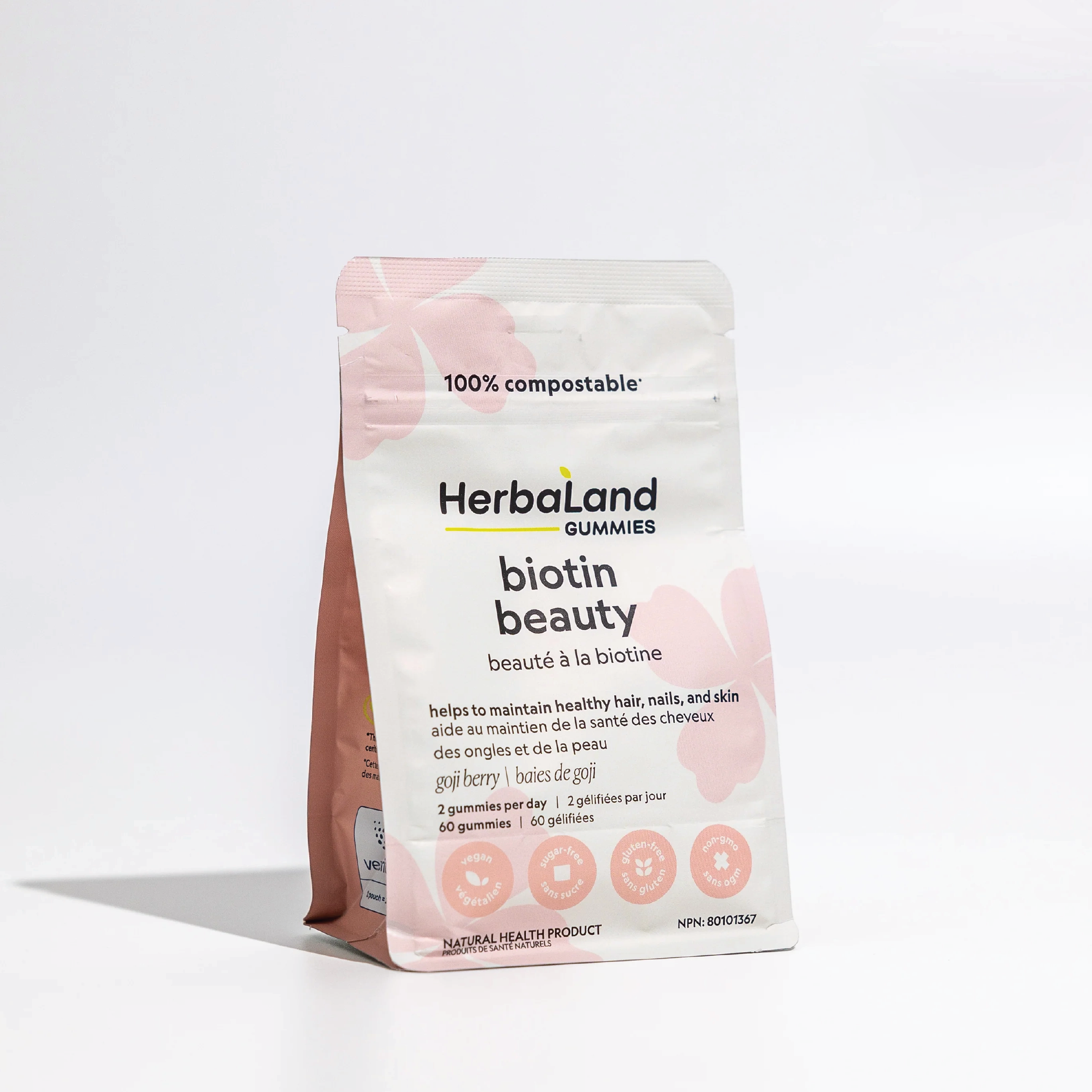
I led the rebranding and transformation of Canada's largest gummy vitamin and healthy nutrition brand Herbaland, in which I created a new, refreshed aesthetic, while incorporating the concept of sustainability. Taking charge of the brand identity and packaging, I employed clean yet eye-catching graphics with vibrant colours to create a standout presence among competitors, while emphasizing the perfect blend of health and fun. Beyond appearances, I prioritized the use of eco-friendly practices and materials, contributing to the brand's sustainability without compromising product quality. This was a remarkable milestone for the company where visually striking designs collided with environmental consciousness.
ADULTS LINE

BEAUTY LINE
KIDS' LINE


SNACKS


WEB SITE LAYOUT

TRADE SHOW BOOTH


RESULTS
1
Timeless and refreshing
packaging design.
2
Sustainable packaging
solutions and approach.
3
A more competitive product
presence on shelves.
TIME TO START MAKING AMAZING
THINGS TOGETHER
[ GET IN TOUCH ]
MY WORK
BEHANCE
Selected Works